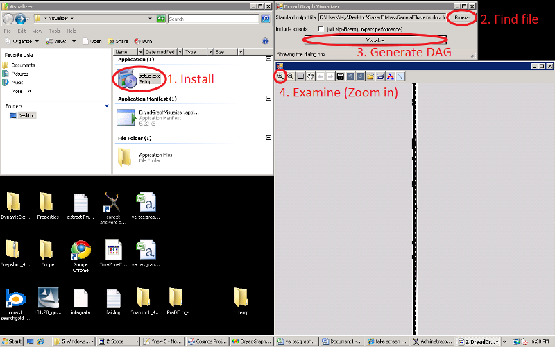
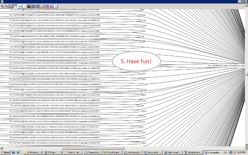
This Sunday I went to my office and prototyped something that has little to do with my assignment. I created a very basic visualization tool that processes the standard output of the job scheduler of our distributed storage and computational platform (Cosmos) and produces a clean graph that shows exactly how a job is executed–on which machines, in which stages, and later on, at what times.
Here’s the first iteration:
Originally, I wanted to use Silverlight to create a real-time (or time-varying) visualization tool for the jobs, so that users can see their jobs’ progress as they are running. However, because of the size of some of our jobs (many are in the petabyte-range and require the simultaneous cooperation of tens of thousands of machines), I needed a solution that could scale, and Silverlight was not it, at least with the little knowledge of it that I have right now.
Eventually, I want a tool that users, developers and testers can leverage to see exactly where a job is as it executes, with respect to network topology and time–so there would be (1) a tool like a video player slider that can reveal different layers–corresponding to progress with respect to time–as you vary it; and (2) a grouping schema that shows the network usage patterns.
The main motivation for this project is the realization that humans are much better finding patterns than dumb computers are. To a computer, traffic through the main switch is just a number; to a human, it’s an inspiration for finding a better solution. I believe that although this tool will solve no problems by itself (except for increasing transparency for a job’s progress), it will be extremely helpful in empowering a human being to improve upon our current system.

